How I Created My Logo and What It Means
Beyond Design: Creating a Logo with Purpose
Let’s be real—a logo is so much more than just a cool image you slap on your website or merchandise. At least, that’s how I see it! For me, a logo is like the heart and soul of a brand, condensed into a single symbol. It’s your first impression, your silent ambassador, and the anchor that holds everything together.
When I started designing the logo for LRY8.Art, I knew it couldn’t just be something trendy or eye-catching. I wanted every single detail—every line, every shape, every color—to have meaning. I wanted it to tell a story, to reflect the deeper journey and intentions behind this whole project. A great logo isn’t just about looking good; it’s about sharing who you are and what you stand for, without even saying a word.
Shapes, colors, and symbols? They’re not just design choices—they’re ways to connect. The right mix can evoke emotions, spark curiosity, and invite people to explore what your brand is all about. But honestly, the real magic happens when you open up and share the story behind your logo. When people understand the meaning woven into each element, the logo becomes more than just a mark—it becomes a message, a symbol of your values and dreams.
I truly believe a logo should serve as a beacon, guiding people toward a deeper understanding of what you’re building. It should spark conversations, make you proud, and remind everyone—including yourself—of the journey you’re on. So, in the next section, I’ll share all the details about how the LRY8.Art logo came to life, what each element represents, and why it matters so much to our community.
Buckle up, grab some coffee and snacks—this is going to be a long ride. Not to brag, but you’ll be really surprised at how much can be packed into a simple logo!
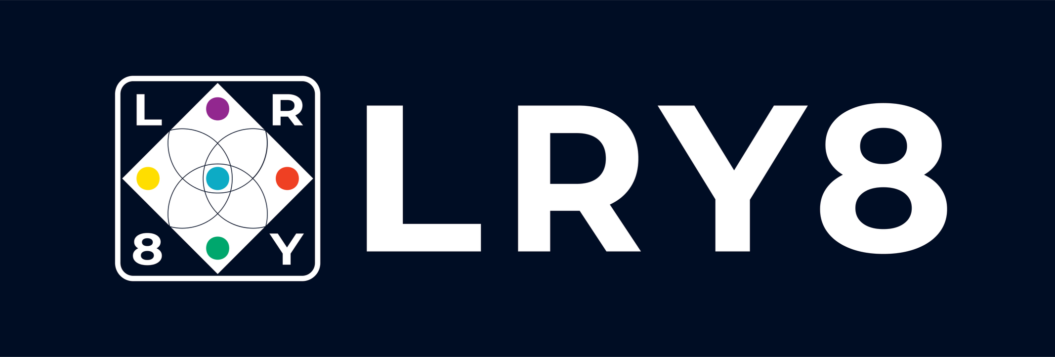
The full logo with text
Finding Inspiration: Ikigai
On my journey of self-discovery and search for meaning, I’ve come across all sorts of ideas and philosophies. But there’s one concept that really stuck with me and changed the way I look at life: the Japanese concept of Ikigai.
Ikigai - 生き甲斐 (pronounced “ee-kee-guy”) is such a beautiful word. It basically means “a reason for being” — that special something that gets you out of bed in the morning, excited for the day ahead. The idea comes from Okinawa, Japan, a place famous for its happy, long-living people and their strong sense of community. What’s cool about Ikigai is that it’s all about finding the sweet spot where what you love, what you’re good at, what the world needs, and what you can get paid for all come together. When you find that balance, life just feels more meaningful and joyful (García & Miralles, 2017).
What I love about Ikigai is that it’s not about chasing money or status. It’s about feeling fulfilled, making a difference, and being part of something bigger than yourself. The book *Ikigai: The Japanese Secret to a Long and Happy Life* by Héctor García and Francesc Miralles explains it in such a relatable way—it’s about waking up with a sense of purpose, not just chasing a paycheck.
For me, discovering Ikigai was a real turning point. It made me rethink my values and what I want LRY8.Art to stand for. So, how did Ikigai influence the LRY8.Art logo design?
Sources:
García, H., & Miralles, F. (2017). Ikigai: The Japanese Secret to a Long and Happy Life.
Amazon Link: https://amzn.to/3NbCodt (PT-BR), https://amzn.to/3MPNzsf (EN-US)
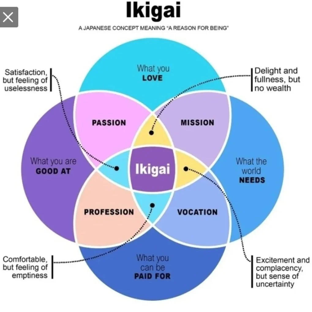
Graphical representation of Ikigai
This image is often used to represent the concept of Ikigai. You’ll see four circles, each representing a different sphere of life: what the world needs, what you can be paid for, what you’re good at, and what you love. Where these circles overlap, you find different aspects of fulfillment—but it’s that sweet spot in the very center, where all four come together, that represents your Ikigai: your reason for being.
Funny enough, you might have seen this diagram before (just look at the LRY8.Art logo)! It’s become a popular way to visualize Ikigai, especially outside Japan. While the original Japanese concept is a bit broader, this image is a great starting point for thinking about how purpose, passion, and contribution can all intersect in your life.
So, as you can see, the foundation for our logo draws directly from that familiar Ikigai diagram. I took the popular visual representation and placed it inside a diamond shape, intentionally symbolizing how the brand is built around and embodies the concept of Ikigai. From there, I layered in initials, shapes, and numerical elements to complete the final design. And trust me, none of those details are random! Every part has a purpose and a story behind it, which I’ll share with you soon.
But before we dive into the meaning behind each letter, shape, and number, let’s talk about another key element: color. The colors in the LRY8.Art logo weren’t chosen at random—they each play a special role in conveying the brand’s spirit and message.
Conveying Meaning Through Color: The Language of Color
Let’s talk about color—one of the most powerful tools in any artist’s or designer’s toolkit. Colors aren’t just about making things look pretty; they’re a language all their own, packed with emotion, symbolism, and meaning. The colors you choose can instantly set the mood, tell a story, and even shape how people feel about your brand.
Think about it: red often brings to mind energy, passion, or urgency. That’s why you’ll see it in everything from stop signs to sales banners. Blue, on the other hand, is calming and trustworthy — no wonder it’s a favorite for tech companies and banks. Yellow radiates optimism and warmth, while green is all about growth, balance, and renewal. Even black and white have their own voices: black can feel elegant or mysterious, while white is clean, simple, and pure.
But here’s the thing—the meanings of colors can vary depending on culture, context, and even personal experience. For example, while white is often associated with weddings and purity in Western cultures, it is a color of mourning in some Eastern traditions.
When I was choosing the colors for the LRY8.Art logo, I thought carefully about what each shade would convey. I wanted every color to reflect a part of the brand’s spirit—creativity, growth, harmony, and inspiration.
First, the dark color in the logo isn’t actually “pure black,” you know? It has a bit more green and blue in it (0% red, 5.1% green, and 14.1% blue for my fellow RGB nerds—the hex code is #000D24). It’s called Black Pearl or Rich Black (fancy, right?). I chose it to add a subtle elegance and a sense of mystery, like the universe itself—because art, to me, is all about exploring and contemplating those cosmic mysteries.
Then, in addition to this prominent background, we have five colorful spheres:
Pomegranate (#EF4023): This one stands for “what you love.” I didn’t go with classic red because it felt too loud and overused. Pomegranate is softer but still bold—representing love, passion, and even resurrection (finding what you love can bring you back to life!). In Jewish tradition, it’s a color associated with righteousness and abundance. Perfect, right?
Jade (#00A76D): Green like money! But also like jade stones, which symbolize harmony, prosperity, and wisdom. Jade is about luck, well-being, and inner peace. Plus, it’s a nod to the brand’s message of financial independence and shared prosperity. (And yes, having money does bring a certain calm — just saying!)
Golden Yellow (#FFDE00): This color represents “what the world needs.” It’s vibrant, joyful, and optimistic—exactly what I wish for the world. It’s also associated with the sun, spreading warmth and positivity. Golden Yellow is about sharing wealth, enlightenment, and true value with everyone.
Dark Purple (#92278F): This one’s for “what you’re good at.” Dark Purple is all about royalty, creativity, and spiritual depth. It’s mysterious and exclusive—just like our unique talents. Our gifts are a key part of our individuality and, when used well, can truly benefit the world.
Vivid Cyan (#0DABC5): Last but not least, I chose vivid cyan to represent the core aspect of Ikigai—one’s reason for being. Vivid cyan is often associated with freshness and tranquility, but because of its vibrancy, it truly evokes that “I am alive” feeling. It can also represent clarity, calmness, and rejuvenation, reminiscent of clear skies and tropical waves. For me, this color represents my reason for being and clarity of purpose on a deep level.
Let me digress for a moment and tell you about the moment I truly understood my Ikigai. I’ll never forget that day—December 31, 2019. I can’t tell you the exact time because I was already on the fifth day of the Universo Paralello 19/20 festival, an electronic music festival on a paradise beach in Brazil. At that point, time didn’t matter.
But I remember exactly who was playing—Nate Raubenheimer with his prog-psy project, Shadow Chronicles. I’d been waiting to hear his track “Everything is Everything,” a song that has always moved me in ways I can’t explain. That day, it became the anchor for a truly special moment—the moment I found myself and caught a glimpse of my reason for being. There’s a line in the song that goes:
“So now, everything is clear, as if a new person had emerged from within me. I can see myself from a perspective I’ve never seen before—no inhibitions, no worries. For the first time, I knew where I belonged, and nothing could stop me from being there. Nothing and everything felt real. The world was beneath me, around me, above me. I can see everything, and everything can see me.”
Yes, for the record, I was a little high at the time. But that voice resonated with me so deeply, and the serenity and calm that washed over me in that moment—as if all my questions had been answered, as if the fog had lifted and I could finally see the clear sky—was indescribable. I felt reborn, as if I’d broken free from a cocoon. That flood of awareness and realization that I am alive, truly alive… there are honestly no words that can fully capture it. But one thing I know for sure: I felt peace, the serenity that comes from knowing what I must do. Actually, the seed for LRY8.Art germinated right then and there.
And now, back to our colors—that’s why vivid cyan represents the essence of Ikigai so strongly to me.
Oh… and here’s a fun little anecdote for anyone who, like me, believes in synchronicity and those mystical things that just seem to happen. And trust me, I’m not making this up! When I chose the colors, I started with a vague idea—red for love, green for money, yellow for positivity, purple for spirituality, and cyan for calm—and then just tweaked the shades until they felt right to me. Only after that did I actually look up the deeper meanings each color can convey, and I was honestly amazed at how perfectly everything fit together. It felt kind of mystical, like the Universe was giving me a little nod of approval.
So, every color in the LRY8.Art logo has a story and a purpose—just like each and every one of us. Next up: the letters, shapes, and the number 8!
Letters Are Boring, Now Numbers … A Little Bit of Numerology
Honestly, there’s no big mystery behind the letters in the logo. The “L” is just the first letter of my name, Lucas—this is my personal brand, after all (even though everything here is really for you). The “R” and “Y” come from my family name, Ryoo. And to be honest, my family name means even more to me than my given name. Without the love and support of my family—my dad, my mom, and my two sisters—I wouldn’t be here today. I was blessed with a beautiful, caring family, and their presence is one of the main reasons I made it through some of my darkest days. My family and close friends are among the greatest blessings in my life (thank you for existing, fam!). (One day, I’ll share more about my journey with depression in a future post about lifestyle and mindset — so stay tuned, and maybe subscribe to the newsletter if you want to follow along!)
The shapes, along with their colors, are meant to represent the spheres of life mentioned in the concept of Ikigai: what the world needs, what you can be paid for, what you’re good at, and what you love.
Now, the “8” is where things get a little more playful—and meaningful. My last name is Ryoo, and the double “oo” at the end? Yep, I turned them into an 8. Ta-da! I know, it’s a bit quirky, but there’s actually a deeper reason for choosing the number 8, and it shaped a lot of the logo design process. The idea was to use the number 8 not just as a nod to my name, but also because it echoes the Ikigai diagram (which, if you look at it, kind of has an 8 shape), and especially because of its meaning in numerology.
For anyone new to numerology, it’s basically the study of the deeper, sometimes mystical significance of numbers and how they appear in our lives. The number 8 is a big deal—it’s all about abundance, balance, power, and achievement. It’s also the symbol of infinity, representing cycles, renewal, and the endless flow of energy. In many cultures, 8 is considered extremely lucky, associated with prosperity and success. For me, weaving the number 8 into the logo was a way to infuse it with all those positive, powerful vibes—and to remind myself (and hopefully you) that life is about growth, balance, and infinite possibility.
Here’s a little more about the symbolism of the number 8, adapted from Copilot’s Search:
“The core meaning of the number 8, often referred to as the ‘achiever’ in numerology, reflects a strong drive for success, leadership, and material achievement, while maintaining balance and fairness in life. Its shape resembles the infinity symbol, symbolizing continuous flow, balance, and the cyclical nature of giving and receiving.
The number 8 is deeply connected to karma and Saturn, the planet of discipline, justice, and responsibility. It teaches that rewards come through resilience, patience, and ethical action, emphasizing that what you give to the world comes back to you. This karmic aspect encourages individuals to balance personal ambition with generosity and integrity.
But here’s the thing: LRY8.Art may have started as my personal vision, but it’s truly a collective journey. Every person who joins, shares, and contributes helps shape what this community becomes. This isn’t just about my story—it’s about all of us, growing, creating, and inspiring each other. Together, we’re building something bigger than any one individual: a movement where everyone’s dreams, talents, and voices matter.
If you haven’t read the “About” page yet, I just want to emphasize how much the text above aligns with my vision for the LRY8.Art brand: this brand is about achieving success and leading by inspiring and sharing. It’s about tangible achievements—both mine and yours. I want you to be inspired, to learn, and to achieve your own success in every aspect of life. This brand is about receiving and giving even more, about keeping energy flowing, ideas flowing, life flowing. It’s proof that we can reach our peak and build something that transcends our own limitations—to touch infinity.
I may have started all of this, but my dream is for this brand to grow into something much bigger than myself—to be one of many symbols representing people who believe, just as I do, that we can be more, we have the power to be more, and we should be more. I want LRY8.Art to be a foundation and a safe haven for dreamers who can envision a better world. That’s a core principle of this brand and the reason why the number 8 is so important to our logo — it represents our ambition and wish for the manifestation of a better world for everyone!
Before we wrap up, there’s one last element in the logo’s composition that I want to highlight: motion. For me, motion is essential. It’s not just about the shapes or the colors—it’s about the energy, the sense of movement, and the feeling that something is always evolving. I wanted the logo to capture that sense of flow, because art, at its core, is alive. It’s always moving, always inspiring, always pushing us forward.
Luckily, everything came together perfectly with my name to form LRY8 — and that’s how LRY8.Art took its final shape: through art and through motion. To me, art is anything created by people that has the power to move and inspire others—things made out of love and a sincere desire to do better. That, in its purest form, is art to me. That’s the LRY8.Art definition of art: a living, moving force that connects us, inspires us, and helps us grow—together.
I Like to Move It, Move It … I Like to! … Move It!
To wrap up everything that went into our logo, let’s talk about movement—and how you can add a sense of motion to something that’s meant to be static. Sure, with today’s video tools, it’s easy to animate a logo and make it spin or bounce (and yes, I’ve had some fun with that myself!). But that’s not the kind of movement I mean.
I’m talking about creating a sense of motion through the design itself. One of the coolest tricks is to use the way we naturally read Western letters—from left to right, top to bottom—to guide the eye and create flow. When you look at the LRY8 symbol, your eye moves from L to R to Y to 8, almost in a circular path. And if you pay attention to the Ikigai-inspired part of the symbol, it’s as if the “oo” in my last name is spinning, or there’s a number 8 in motion at the heart of the logo.
But there’s more! I took some creative liberties and rearranged the elements of the Ikigai diagram to better fit my story and my vision for the brand:
My journey began when I discovered what I love—that’s why the pomegranate sphere is on the right. Finding my passion was the spark that set everything in motion for LRY8.Art. The love sphere sits inside a triangle-like shape pointing to the right, reminding us of the powerful beginnings that come from following our hearts.
Next comes the jade-colored sphere, representing “what you can be paid for.” It follows love, symbolizing my wish to earn a living doing what I love. Placing it at the bottom makes it both a foundation and a reminder that money isn’t the top priority. The downward-pointing triangle shape serves as a reminder to stay grounded.
Then comes the golden yellow sphere, representing the value I have to share with the world. It symbolizes my desire to give something precious in return. Placed within a triangle-like shape pointing to the left—outward—it reflects my intention to offer what I have to others.
Finally, the dark purple sphere represents “what you’re good at.” By sharing what I love with the world, I can hone my talents and lift my spirit. That’s why purple occupies the top, or “north,” position and is placed within an upward-pointing triangle-like shape.
And at the heart of it all, everything revolves around my purpose—my Ikigai. The four triangle-like shapes pointing to each of the cardinal directions convey a sense of expansion and growth—personal, for the brand, and for the community.
This is how I created a sense of motion: by using the natural flow of reading and the familiarity of shapes, I wove my journey into the design, which represents the core ideas that led me to establish LRY8.Art.
And here we are at the end of our post. I truly hope you enjoyed reading it and that it has inspired you to see logos—and maybe even yourself—in a new light. More than anything, I hope this article encourages you to create your own logo, your own brand, and to share your story and message with the world. Express yourself! If we don’t tell our stories, if we don’t show our worth, if we don’t express ourselves to provoke and inspire, nothing will ever change. So go out there—shout to the world, show them who you are, and let your logo be your banner announcing a new player ready to fight!
Thank you so much for reading, and I hope to see you again soon.
With gratitude,
Lucas Ryoo
P.S. Psst… don’t miss any of my new blog posts! Subscribe to my newsletter below 😘
P.S.2 Oh yeah … I just realized after finishing this post—the center part looks like an eye and can be seen as a nod to the concept of vision. I love these kinds of happy accidents, because this wasn’t something I intentionally placed there, but now it’s part of the story!
Amazon links for a book on Ikigai: https://amzn.to/3NbCodt (Portuguese), https://amzn.to/3MPNzsf (English)
Here’s the full logo again—do you still think it’s just a cool logo after reading everything in this post?
